Painted in Motion
The Evolution of the Indian Motorcycle War Bonnet Tank Logo
Few motorcycle tank logos are as instantly recognisable — or as historically layered — as the Indian Motorcycle war bonnet. More than decoration, the emblem charts the brand’s rise, collapse, rebirth, and repeated efforts to balance heritage with modern identity.
This article focuses exclusively on the evolution of the Indian Motorcycle tank logo “war bonnet” introduced in the late 1940s. To understand where Indian Motorcycle may be heading next, it helps to look carefully at how the war bonnet imagery arrived on the tank — and how its colours have been refined, restrained, and possibly poised for return.
Before the Bonnet: When “Indian” Was Enough (1901–1910)
When Indian Motorcycle was founded in 1901 in Springfield, Massachusetts, branding was minimal and functional. Early machines carried little more than the word Indian painted or applied to fuel tanks in a flowing cursive script, typically in deep burgundy or black.
At a time when motorcycles were still an engineering novelty, the name itself was the brand. Racing success — not imagery — built reputation. Indian’s early dominance on board tracks and dirt ovals meant recognition came through performance rather than symbolism.
There was no war bonnet, no profile head, and no formal colour strategy beyond what hand-applied finishes and early paint technology allowed.
The Emergence of the War Bonnet Imagery (1910s)
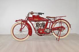
By the 1910s, Indian Motorcycle’s branding began to evolve beyond simple script. Native American profile imagery increasingly appeared in advertising, promotional material, and brand ephemera, laying the foundation for what would become Indian’s most enduring visual symbol.
This shift reflected early 20th-century branding norms, where manufacturers sought powerful, instantly recognisable imagery to convey identity. For Indian, the symbolism aligned naturally with qualities already proven on track and road: speed, endurance, independence, and forward motion.
Early applications of the war bonnet imagery were restrained. On tanks and badges, designs were typically rendered in single-colour or limited-colour formats, most often using burgundy, cream, and black. The emphasis was on silhouette and recognition rather than fine detail.
Colour and Character Take Shape (1920s–1930s)
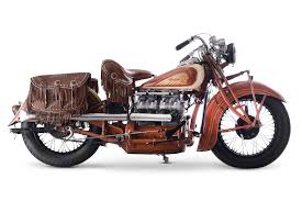
As printing, enamelling, and paint techniques advanced through the 1920s and 1930s, the war bonnet gained definition and character. More expressive colour treatments appeared across advertising, tank badges, and dealership materials, even as production fuel tanks generally retained simplified applications.
Colour palettes varied widely by era and market, commonly incorporating burgundy, brown, cream, teal, and black. The feathers of the headdress became a visual storytelling element, reinforcing motion and identity without overwhelming the motorcycle itself.
This period firmly established the war bonnet as Indian Motorcycle’s visual anchor — a symbol that endured even as competitive pressure and financial strain began to mount.
Simplification Under Pressure (1940s–1950s)
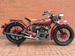
By the post-war era, Indian Motorcycle was fighting for survival. Production constraints, rising costs, and changing consumer preferences forced simplification across the range.
Factory tank logos during this period typically returned to single-colour or limited-colour treatments, often paired with plain Indian script. The emblem remained proud and unmistakable, but complexity was reduced in favour of practicality and consistency.
Dealer creativity, however, occasionally told a different story.
The “Rainbow” Chief: Colour as Expression (1951)
One of the most famous deviations from factory restraint came in 1951, when Indian dealer Bob Stark created what later became known as the “Rainbow” Chief. Featuring two colours blended together with hand-applied pinstriping, the motorcycle reflected the artistic influence of the DuPont paint era and the growing culture of personalisation.
Though never a factory standard, the Rainbow Chief has since become an important reference point in discussions of Indian’s relationship with colour — proof that expressive finishes have long been part of the brand’s folklore, even when not officially sanctioned.
Collapse, Dormancy, and Fragmentation (1950s–2000s)
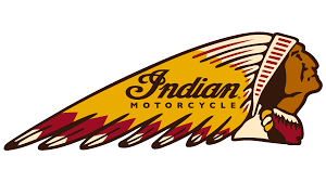
Following Indian’s collapse in the early 1950s, the war bonnet entered a prolonged period of inconsistency. Various revival attempts used differing interpretations of the logo, ranging from crude reproductions to heavily stylised modernisations.
Colour usage during this era lacked cohesion, often driven by licensing arrangements rather than a unified brand philosophy. The war bonnet endured, but without a stable visual language.
The Gilroy Era: Reintroducing the Headdress (1999–2003)
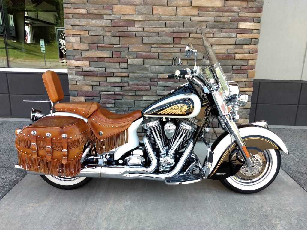
Indian’s modern return began in Gilroy, California, where production restarted in 1999. During this period, the war bonnet reappeared prominently on fuel tanks, often as a three-dimensional badge or detailed graphic.
Gilroy-era logos leaned heavily into heritage cues, sometimes incorporating more colour and chrome than later interpretations. While visually bold, consistency varied by model and year, reflecting a revival driven more by passion and nostalgia than long-term brand discipline.
These bikes played a crucial role in re-establishing the war bonnet on modern machines — even if the execution was still evolving.
Kings Mountain: Heritage Without Stability (2006–2011)
Following the Gilroy collapse, Indian Motorcycle briefly re-emerged under the Indian Motorcycle Company of America, based in Kings Mountain, North Carolina.
During this short-lived era, the war bonnet remained central to tank branding, often presented with traditional colours and classic layouts. However, limited production volumes and financial instability meant branding lacked long-term consistency.
Kings Mountain is best understood as a transitional chapter — one that kept the war bonnet alive while the brand awaited a more secure future.
The Polaris Era: Control and Consistency (2011–Present)
When Indian Motorcycle was acquired by Polaris Industries in 2011, brand discipline became a priority. The war bonnet was retained but simplified and tightly controlled:
- Predominantly single-colour
- Clean lines with minimal detailing
- Frequently enclosed within a circular badge
Around 2021–2022, dealers were advised to standardise the use of the white logo on a red background across signage, apparel, and marketing. This guidance applied to modern Polaris-era motorcycles and materials, not historical restorations or archival references.
The objective was clarity and global consistency as Indian re-established itself as a premium international marque.
Controlled exceptions did occur. Heritage-inspired logo treatments appeared in limited contexts, signalling that Indian’s past had been curated rather than erased.
Is Colour Returning?
As Indian Motorcycle enters its 125th year, credible reports from recent dealer and influencer event in LA it suggest that the conversation around colour may be shifting once again.
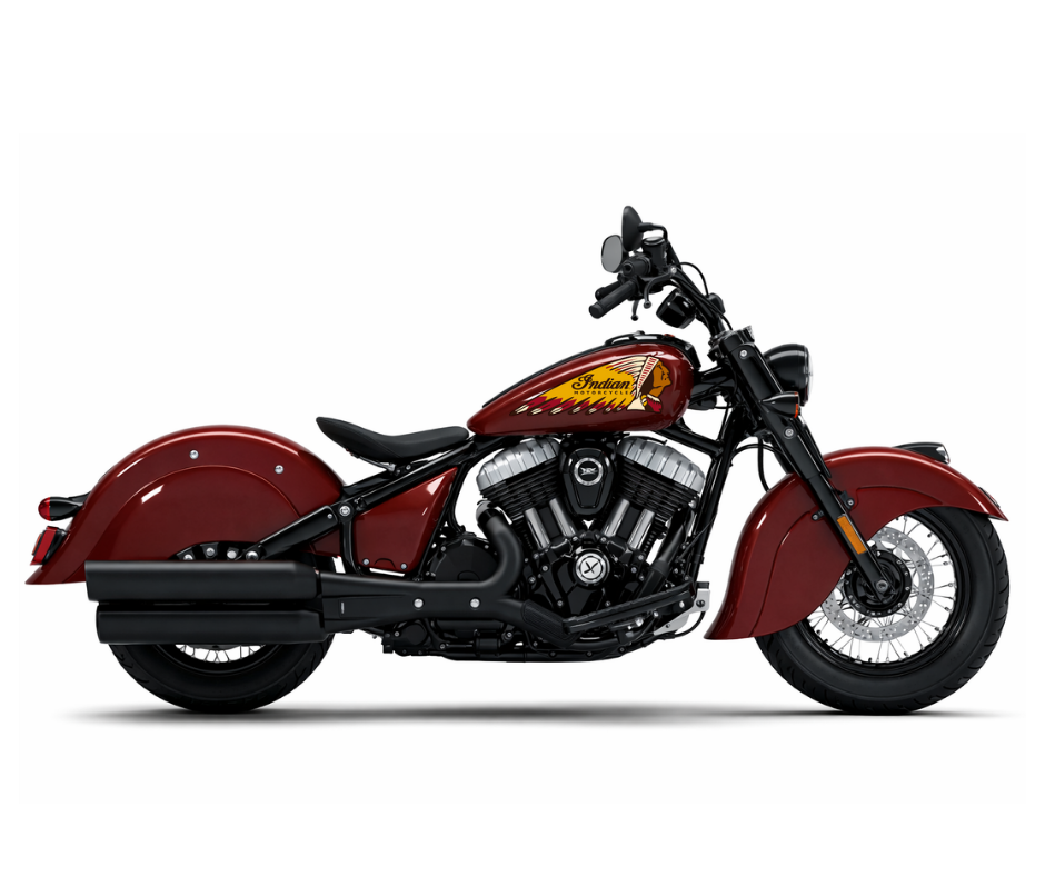
While unconfirmed, multiple sources indicate that dealers were shown materials featuring a multicoloured war bonnet. If accurate, any return of colour is most likely to appear first in dealership environments, apparel, and commemorative branding, rather than immediately on production fuel tanks.
Such a measured approach would align with Indian’s modern strategy: celebrating heritage while preserving a coherent global identity.
A Living Emblem
The Indian Motorcycle war bonnet has never been static. It has evolved alongside the company itself — simplified when survival demanded restraint, embellished when confidence allowed expression, and controlled when consistency mattered most.
If colour does return in a more visible form, it will not be a novelty. It will be the continuation of a visual language that has always adapted to the era it inhabits.
For a brand built on reinvention as much as legacy, the tank logo remains more than a mark. It is a mirror of where Indian Motorcycle has been — and where it may be heading next.

One Response
Indian forever, forever Indian!